Keyword Distribution
The Keyword Distribution chart shows how keywords are spread across ranking positions—revealing at a glance whether visibility is concentrated in top positions or spread across deeper results.
Quick start
1. Select a Search Group to filter results
2. Click the Distribution tab
3. Review the stacked column chart showing keyword counts by position range
4. Compare distribution across search engines using the legend
Understanding the display
The chart displays a stacked column for each position range. Each colour represents a different search engine, allowing comparison of keyword distribution across Google, Bing, Yahoo, and other tracked engines.
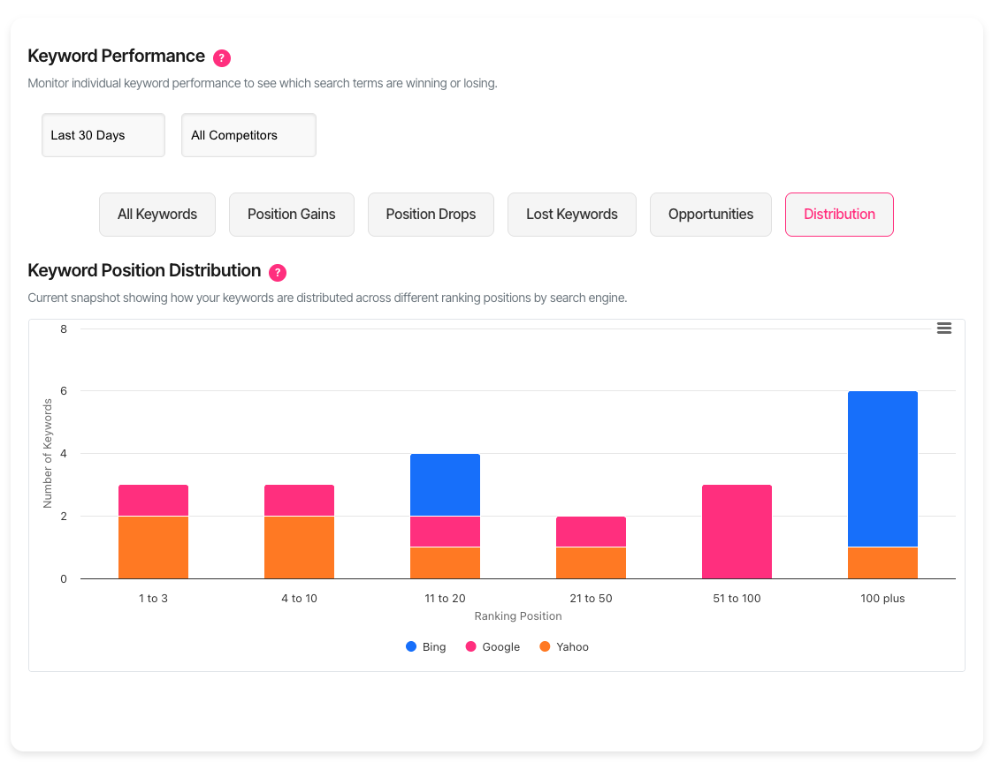
Position ranges
| Position range | Meaning |
| 1 to 3 | Top positions—maximum visibility and traffic |
| 4 to 10 | Remainder of page 1—strong visibility |
| 11 to 20 | Page 2—limited visibility, occasional clicks |
| 21 to 50 | Pages 3–5—rarely seen by searchers |
| 51 to 100 | Deep results—minimal visibility |
| 100 plus | Not effectively ranked—no meaningful visibility |
Reading the chart
Each column shows the total keyword count for that position range. The stacked segments show how those keywords are distributed across search engines. Taller columns indicate more keywords in that range.
Hover over any segment to see exact counts per search engine.
What should I do next?
| Distribution pattern | Action |
| Most keywords in 1–3 | Strong position. Focus on maintaining rankings. |
| Most keywords in 4–10 | Good visibility. Target top 3 for highest-value keywords. |
| Most keywords in 11–20 | Near page 1. Run AI Analysis to identify quick wins. |
| Most keywords in 21–50+ | Major improvement needed. Prioritise content strategy. |
| Even spread across ranges | Mixed performance. Focus effort on high-volume keywords. |
| One engine significantly worse | Engine-specific issues. Investigate technical or content gaps. |
Using the filters
Search group
Select a search group to view distribution for keywords in that tracking configuration. The chart updates automatically when the search group changes.
Category
Filter by keyword category to focus on specific content types or page groups. This narrows the distribution view to keywords in the selected category only.
Workspace
If workspaces are configured, the chart respects the active workspace selection. Only domains within the current workspace contribute to the distribution.
Interactive features
Tooltips
Hover over any column segment to see the position range and keyword count for each search engine. The tooltip displays all engines with keywords in that range.
Legend
The legend at the bottom identifies each search engine by colour. Click a legend item to show or hide that engine's data, making it easier to focus on specific engines.
Export
Use the menu icon in the chart corner to export as PNG, JPEG, or SVG for reports and presentations.
Understanding the data
What gets counted
The chart counts the latest position for each keyword across each search engine. If a keyword ranks at position 5 on Google and position 12 on Bing, it contributes one count to "4 to 10" for Google and one count to "11 to 20" for Bing.
Why totals may differ between engines
Not all keywords rank on all search engines. If a keyword ranks only on Google, it only appears in Google's distribution. This is expected behaviour—different engines produce different results.
What a healthy distribution looks like
A healthy keyword distribution typically shows:
• Concentration in positions 1–10 — The majority of tracked keywords appear on page 1
• Minimal keywords in 100+ — Few keywords are effectively unranked
• Consistent pattern across engines — Similar distribution on Google, Bing, and others
A distribution weighted toward 21+ positions indicates opportunities for content improvement and optimisation.
Troubleshooting
No data displayed
Verify a search group is selected. The chart requires a search group to load data. Also confirm keywords are being tracked and have recent position data.
Only one engine showing
Only engines with ranking data appear. If keywords are only tracked on Google, only Google appears in the chart. This is normal if tracking is limited to specific engines.
Error loading data
Refresh the page. If the problem persists, verify the search group and category selections are valid.
FAQ
Why are the position ranges grouped this way?
The ranges align with meaningful visibility thresholds. Positions 1–3 receive the most clicks. Positions 4–10 complete page 1. Position 11+ represents page 2 and beyond, where visibility drops significantly.
Does this show historical data or current positions?
The chart shows the most recent position for each keyword. Historical distribution over time is not displayed in this view.
Can I see which specific keywords are in each range?
The distribution chart shows aggregate counts. Use the All Keywords tab to see individual keyword positions and filter by position range.
Why do Google Desktop and Google Mobile show separately?
Mobile and desktop rankings can differ significantly. Tracking them separately reveals whether mobile performance matches desktop, which is important given mobile-first indexing.
Getting help
Contact support for persistent issues